Every year brings new lists of web design trends. For businesses, though, the interesting question isn’t what’s “in” right now, but: which of these trends make a website better – and which will look dated in two years?
In this article I’ll walk you through the most important web design trends for 2026 – with a special look at Liquid Glass, Apple’s new glass aesthetic, which I’m already using in client projects. And I’ll be honest about where its limits are.
1. Liquid Glass: how an Apple trend reaches web design
Apple has shaped the visual language of digital interfaces for years. You can see this clearly in the evolution of iOS:
- iOS 1–6: realistic textures and “material” elements – the era of skeuomorphism
- iOS 7 (2013): the radical shift to flat design – minimalism, simple shapes, clean colours
- iOS 10–15: flat design becomes more alive – depth, translucency, blurred layers
- iOS 16–17: more motion, volume and dynamic elements
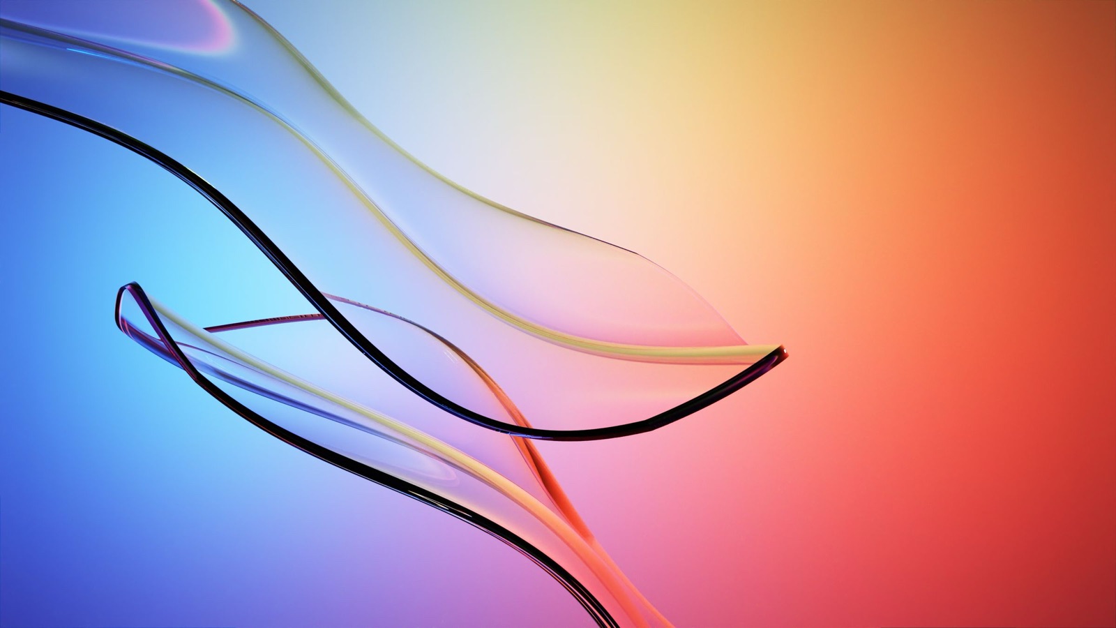
On 9 June 2025, at its WWDC developer conference, Apple introduced Liquid Glass: a translucent material that reflects and refracts its surroundings and whose colour adapts to content as well as light and dark mode. Since iOS 26 (September 2025) it has defined the interfaces on iPhone, iPad and Mac.
What Liquid Glass brings:
- a glass-like, “living” aesthetic
- volume and layered depth
- soft transitions of light and colour
- transparency and lightness
- elements that react to motion, background and light
From the iPhone to websites
The path of such a trend onto the web is almost always the same: Apple introduces a style in iOS, trains designers and developers, the style becomes the norm in apps – and then gradually moves onto websites, brands and digital products. It happened with flat design and glassmorphism, and it’s happening now with Liquid Glass.
In a recent project for a consulting firm in construction and architecture, we’ve already implemented Liquid Glass, frosted glass, depth and light transitions. The style fits architecture and contemporary construction perfectly – and keeps the website visually relevant for years.
The downside: readability
Liquid Glass is not uncontroversial. In October 2025 the Nielsen Norman Group criticised that translucent controls and text over busy backgrounds are hard to read, and that animations distract from content. Apple has made adjustments: iOS 26.1 added a setting to reduce transparency, and at WWDC 2026 Apple lowered the default transparency further for its next system generation.
For websites this means: use glass effects deliberately, not everywhere. They work well for navigation, cards and call-to-action areas – always with sufficient contrast (at least 4.5:1 for normal text according to WCAG) and a calm surface behind the text.
2. AI in the design process – and why craft matters more
According to Figma’s “State of the Designer 2026”, 72% of the designers surveyed use generative AI in their work. AI speeds up drafts, image ideas and variations enormously.
The flip side: many websites look more and more alike. That’s exactly why distinctive, well-thought-out design becomes the difference in 2026 that customers notice immediately.
3. Bold colours and expressive typography
After years of beige and grey, saturated colours, gradients and high-contrast combinations are back. They’re paired with large, expressive typography that becomes part of the story. What matters: colour and type have to fit the brand – not the trend.
4. Motion with meaning
Micro-interactions and scroll animations make websites feel alive and guide attention. Good motion explains something – where to click, what has changed or how content connects. Pure decoration that costs loading time or distracts does more harm than good.
5. 3D and immersive elements
Interactive 3D models and spatial effects have become far more accessible in 2026. For products, spaces or architecture they can show a lot. For most small businesses: one targeted effect rather than a heavy 3D page that loads slowly on a smartphone.
6. Dark mode as standard
Dark interfaces have long been a habit for many users – easier on the eyes and more efficient on OLED screens. A well-designed dark look also feels premium and modern; glass effects look particularly good on dark backgrounds.
7. Accessibility becomes mandatory
Since 28 June 2025, Germany’s Accessibility Strengthening Act (BFSG) has been in force. It mainly affects digital offers for consumers, such as online shops; micro-enterprises offering services are exempt. Regardless of legal duty: good contrast, clear structure and keyboard operability make a website better for everyone – and go hand in hand with search-engine-friendly structure.
8. Fast and sustainable
Lean code, optimised images and efficient hosting are no longer a niche topic. Fast websites keep visitors, rank better and use less energy. The more effects a page has, the more important clean technical implementation becomes.
What does this mean for your business?
Not every trend belongs on every website. My rule of thumb: a trend is worth it if it strengthens your brand and doesn’t make the site harder to use. Liquid Glass, bold colours or motion can make a website unmistakable – if they’re used deliberately and implemented cleanly.
A website should stay modern for years. That’s exactly why it pays to understand trends early and adapt them to your brand – instead of using an interchangeable template.
Would you like a website that’s modern and still easy to use? Get in touch.
Sources
- Apple Newsroom: Apple introduces a delightful and elegant new software design (9 June 2025)
- Nielsen Norman Group: Liquid Glass Is Cracked, and Usability Suffers in iOS 26 (10 October 2025)
- Figma: Top Web Design Trends for 2026 (incl. State of the Designer 2026)
- W3C: WCAG 2.2 – Contrast (Minimum)
- IHK: Accessibility of websites, products and services (German)

